
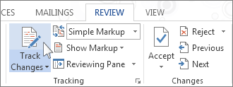
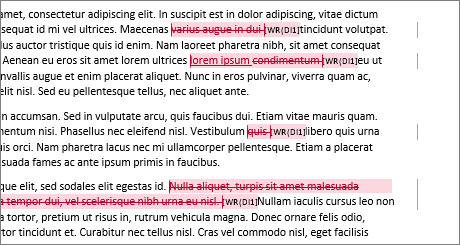
Source: https://nybookeditors.com/2015/01/copyediting-vs-line-editing/ What do you need an edit or a copyedit? Many authors don’t fully grasp the difference between a line edit and a copyedit. There are some similarities between the two: both pay detailed attention to your use of language, and involve mark-up on the pages of your manuscript. But make no mistake, these are two completely different processes, handled by professionals with different skill sets, and should occur at very different times during the writing process. A line edit addresses the creative content, writing style, and language use at the sentence and paragraph level. But the purpose of a line edit is not to comb your manuscript for errors – rather, a line edit focuses on the way you use language to communicate your story to the reader. Is your language clear, fluid, and pleasurable to read? Does it convey a sense of atmosphere, emotion, and tone? Do the words you’ve chosen convey a precise meaning, or are you using broad generalizations and clichés? An editor may draw your attention to: The purpose of working with a general editor in this way is not just to improve your current manuscript, but to give you the creative tools to become a better writer in ways you can carry with you to future projects. By contrast, the goal of a copyedit is to address flaws on a very technical level – to make sure the writing that appears on the page is in accordance with industry standards. This is like an incredibly high-end proofread. A copyedit: Internal consistency means your plot, setting, and character traits don’t have discrepancies. For example if on page 41 you write: Rosemary wore her blond hair in a bun, and then on page 67 you write Rosemary brushed her long black hair, it’s a copyeditor’s job to point that out. There will be some overlap between the work of a general editor and a copyeditor. Most developmental editors will point out technical errors or logical inconsistencies when they jump out, because they’re trying to make your writing better, and because editors tend to be perfectionists by disposition (guilty as charged!). But it is not the specific purpose of a line edit to comb through your prose, fix your grammar, typos, capitalize proper nouns, or change all spellings of colour to color because we’re in America, not Britain. This is the job of a copyeditor, and it requires a rule-based understanding of standard American English usage that traditional editors don’t have. As such, your copyedit will come with a “style sheet” that explains how these rules and principals apply to specific things in your manuscript. So while your general editor will probably not have the Chicago Manual of Style committed to memory, your copyeditor might. There is one other reason that line editing and copyediting aren’t the same job: copyediting should always come after line edit, never at the same time or before. The page-by-page, sentence-by-sentence content of your manuscript should be completely finalized before being fine-tuned on the level of a copyedit. Because what is the point of spending time (and money) proofreading portions of an early draft that might be significantly altered, or even completely cut, by the time the final draft rolls around? At a publishing house, a copyeditor is usually the last person who touches the text of a manuscript before it goes into production – after the editor who bought your manuscript has taken you through revisions and given the final sign-off on your book’s content. So, to make a sweeping and totally reductive generalization, the job of a general editor is to help you tell a better story, and the job of a copyeditor is to make sure the grammar on every page is correct. Just in case you’re still a little unsure, here are a couple of examples that show how a developmental editor and a copyeditor might work on a similar piece of text. These examples are adapted from an earlier post you might want to check out, called The Biggest Mistake Beginning Writers Make. EXAMPLE 1) Original passage: She reluctantly handed over her purse, and nervously waited to have it placed back in to her hands. She felt a rush of relief as the Security Guard finished his search after 30 seconds and handed it back to her. The same passage, after a line editor has helped the author rewrite it so that it reads more fluidly: She was reluctant to hand over her purse, and felt a rush of relief as the Security Guard finished his search and placed it back in to her hands 30 seconds later. And the same passage, after it’s been copyedited for grammar and usage (with edits in bold): She was reluctant to hand over her purse, and felt a rush of relief as the security guard finished his search and placed it back into her hands thirty seconds later. EXAMPLE 2) Another Original passage: The rising light of the sun was quickly brightening. Dawn was turning into morning. Alex finished reading her copy of the “New York Times” and put the paper down on the table, and then grabbed her ipod and put on Beyoncé’s Crazy in Love and went out for her mourning run. After a line editor has helped the author to rework it so that it reads more fluidly: The dawn light brightened, giving way to morning. Alex tossed “The New York Times” onto the table, grabbed her ipod, and then put on Beyoncé’s Crazy in Love as she headed out for her morning run. *Notice here, the line editor caught and fixed a couple of technical errors, like the typo on the second use of “morning” and the inclusion of “The” as part of the newspaper’s title. But even more is fixed… After the passage has been copyedited for grammar and usage: The dawn light brightened, giving way to morning. Alex tossed The New York Times onto the table, grabbed her iPod, and put on Beyoncé’s “Crazy in Love” as she headed out for her morning run. When you want to see who’s been making changes to your document, turn on the Track Changes feature. On the Review tab, in the Tracking group, choose Track Changes. When you turn on Track Changes, Word marks up new changes made to the document. When you turn off Track Changes, Word stops marking up new changes. Any changes that were already tracked remain marked up in the document until you remove them.
When you turn on Track Changes, Word marks up and shows any changes that anyone makes to the document.
On the Review tab, in the Tracking group, in the Simple Markup list, choose a view option.
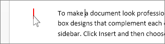
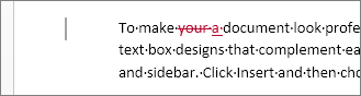
Simple Markup is the default option, and indicates where changes are with a red line in the margin.
No Markup hides markup to show what the incorporated changes will look like.
Note: You can see the markup again by choosing Simple Markup or All Markup.
All Markup shows all edits with different colors of text and lines.
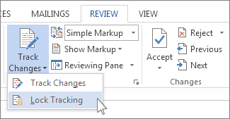
Original shows the document in its original form. In the Show Markup list, choose the revisions you'd like to see—Comments, Ink, Insertions and Deletions, Formatting, Balloons, Specific people. You can prevent someone else from turning off Track Changes by turning on Lock Tracking and adding a password. When Tracked Changes is locked, you can't turn off the feature, and you can’t accept or reject the changes. On the Review tab, in the Track Changes list, choose Lock Tracking.
Do one of the following: In the Lock Tracking dialog box, enter a password, type it again in the Reenter to confirm box, and then choose OK.
Note: Adding a password is optional. It's not a security feature. It is intended, however, to discourage others from turning off Track Changes. In the Lock Tracking dialog box, choose Cancel.
Turn off Lock Tracking
In the Track Changes list, choose Lock Tracking. If you added a password, enter it when prompted, and then choose OK.
Note: Track Changes is still on, but you can accept and reject changes. The only way to remove tracked changes in a document is to accept or reject them. Choosing No Markup in the Display for Review box helps you see what the final document will look like—but it only hides tracked changes temporarily. The changes are not deleted, and they’ll show up again the next time anyone opens the document. To delete the tracked changes permanently, accept or reject them.
Accept or delete a single tracked change
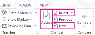
Open your document. On the Review tab, in the Changes group, choose Next or Previous. Choose Accept or Reject.
Accept or delete all tracked changes
Open your document. On the Review tab, in the Changes group, do one of the following: In the Accept list, choose Accept All Changes. or In the Reject list, choose Reject All Changes. Word either accepts the change or removes it, and then moves to the next change.
View comments
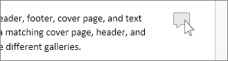
Word shows a balloon where someone’s made a comment. To see a comment, choose the comment balloon.
To see the changes, click the line near the margin. That action switches Word into All Markup view.
Delete a single comment
Choose a comment, and on the Review tab, in the Comments group, choose Delete.
Delete all comments
On the Review tab, in the Comments group, in the Delete list, choose Delete All Comments in Document.
Tips: Before you share the final version of your document, it’s a good idea to run Document Inspector. This tool checks for tracked changes and comments, hidden text, personal names in properties, and other information you might not want to share widely. On the File tab, choose Info > Check for Issues > Inspect Document. To learn more about comments, see Insert and delete comments. A valuable feature is the ability to
track changes made to a story by each contributor in the writing
and editing process. Whenever anyone adds, deletes, or moves text
within an existing story, the change is marked in the Story Editor
in InDesign or the Galley and Story views in InCopy. You can then
accept or reject the changes. Use the Track Changes panel in InDesign or the Track Changes
toolbar in InCopy to turn Track Changes on or off and to show, hide,
accept, or reject changes made by contributors. Choose Window > Editorial > Track Changes
to open the Track Changes panel (InDesign), or choose Window >
Track Changes to open the Track Changes toolbar (InCopy). With
the insertion point in text, do any of the following: To enable change-tracking in only the current story, click
the Enable Track Changes In Current Story icon (InDesign) To enable tracking in all stories, choose Enable
Track Changes In All Stories from the Track Changes panel menu. (InCopy) To enable tracking in all open stories in a multistory
document, choose Changes > Enable Tracking In All Stories. Add, delete, or move text within the story as needed. Note:
When Track
Changes is turned on, a track changes icon When
Track Changes is turned on, each change is marked by default as
follows in Story Editor (InDesign) or in Galley and Story views
(InCopy): Note:
The Track Changes section of the
Preferences dialog box lets you choose a color to identify your
changes. It also lets you select which changes (adding, deleting,
or moving text) you want tracked and the appearance of tracking. Added text Highlighted.
Deleted text Highlighted and marked with a strikethrough.
Moved (cut-and-pasted) text Highlighted and marked with a strikethrough in its original location; highlighted and boxed in the new location. Note:
If you cut text from one document and paste it into another, it is displayed as deleted text in the document of its original location and as added text in its new location.
Copied text Highlighted in the new location. The original text is unchanged.
Change bars A change bar
is a vertical line that appears to the left of a line of text that
has been changed. You can choose whether to show or hide change bars
as you work. You can also specify what color to use for displaying
the change bars. When
changes are hidden, the text appears as it would with the change-tracking feature
turned off. That is, added text is visible, deleted text is invisible,
and moved or pasted text appears where it has been inserted. (InDesign) When change-tracking is turned on, editing is tracked
regardless of whether you work in Story Editor or in the document
layout. You can view changes only in Story Editor, not in the layout. (InCopy) When change-tracking is turned on, editing is tracked
regardless of whether you work in Galley, Story, or Layout view.
You can view changes only in the Galley and Story views, not the
Layout view. In the Track Changes panel (InDesign) or the Track Changes
toolbar (InCopy), click the Show/Hide Changes button With
the insertion point in text, do any of the following: To disable change-tracking in only the current story, click
the Disable Track Changes In Current Story icon (InDesign) To disable tracking in all stories, choose Disable
Track Changes In All Stories from the Track Changes panel menu. (InCopy) To disable tracking in all open stories in a multistory
document, choose Changes > Disable Tracking In All Stories. Note:
If you disable tracking, no further changes are tracked. Previously
tracked changes are not affected. Choose
Window > Track Changes. Click the insertion point in a change. The Track Changes
panel displays the date, time, and other change information. When changes have been made to a story,
whether by you or by others, the change-tracking feature enables
you to review all changes and decide whether to incorporate them
into the story. You can accept or reject single changes, only portions
of a tracked change, or all changes at once. When you accept a change, it becomes a normal part of the text
flow and is no longer highlighted as a change. When you reject a
change, the text reverts to how it was before the change was made. In Story Editor (InDesign) or Galley or Story view (InCopy),
position the insertion point at the beginning of the story. In the Track Changes panel (InDesign) or the Track Changes
toolbar (InCopy), click the Next Change button Do any of the following: Note:
To accept or reject the highlighted change and
go to the next change, Alt-click (Windows) or Option-click (Mac
OS) the Accept Change or Reject Change button. To move back to the previous change or skip over a change and go to the next one, click the Previous Change button To accept or reject all changes without reviewing, click the Accept All Changes In Story button To accept or reject all changes in the story or in the document, or to accept or reject all changes by a certain participant, choose the appropriate option from the Track Changes panel menu (InDesign) or from the Changes menu (InCopy). Note:
If you change your mind about accepting or rejecting a change,
you can undo the change by choosing Edit > Undo or pressing
Ctrl+Z (Windows) or Command+Z (Mac OS). Choosing an Accept All Changes or Reject All Changes command
also applies to hidden conditional text. Preference settings let you
control many tracking options. You can choose a color to identify
your changes and select what changes you want tracked: adding, deleting,
or moving text. You can also set the appearance of each type of
tracked change, and you can have changes identified with colored
change bars in the margins. Choose Edit > Preferences > Track
Changes (Windows) or InCopy > Preferences >
Track Changes (Mac OS). Select each type of change that you want to track. For each type of change, specify the text color, background
color, and marking method. Select Prevent Duplicate User Colors to ensure that all users
are assigned different colors. To show change bars, select the Change Bars option. Choose
a color from the Change Bar Color menu, and specify whether you
want change bars to appear in the left or right margin. Select Include Deleted Text When Spellchecking if you want
to spell-check text marked to be deleted. Click OK. By Alex Painter Would you trust a five star hotel offering 'luxry accommodation'? Or an online retailer who asked for your 'adress' in a contact form? I wouldn't. And I'm not alone. However, even if you believe that most of your customers don't care about spelling errors, ignoring those who do is terrible business practice. Of course, it's not just spelling. Inconsistencies and poor grammar can be just as off-putting. In reality, most organizations appreciate their importance. When mistakes do occur, it's rarely because people don't care. More often than not, it's a combination of a lack of skills and inadequate processes that gets in the way. So here are five tips that will help you to avoid those embarrassing errors. If you don't have one, create a house style for your organization. What do I mean by that? Well, this is really about consistency, and it's especially important in larger organizations, where brochures, catalogues, websites and ads may be written by teams of different people, some from external organizations, such as advertising or PR agencies. The point is that, by and large, all these communications should share a single 'voice'. They should read pretty much as though they were all written by the same person. Don't get me wrong – I'm not saying that your corporate brochure copy should look just like the copy on your 48-sheet poster. Much depends on the audience and the medium. But there are some basic things that should always be consistent. If you're unsure how to get started, there's a useful guide to building your house style here. This is a simple but important point. People often check the fine details meticulously, while missing mistakes that, on the face of it, should be obvious. So, for example, when you're proofreading advertising copy, pay particular attention to headlines. It's all too easy to skip over them, assuming that there can't be a mistake in the headline because someone would have noticed. That someone should be you! This distinction is essential to making sure you don't end up in an endless cycle of writing and rewriting. Very broadly, proofreading is mainly about checking for mistakes that might have crept in between the editing stage and the design / typesetting stage. The proofreader is also expected to pick up clear errors that were missed during editing. Copy-editing is also about picking up errors, but in addition it can involve rewriting parts of the text (e.g. to make it clearer). Why is it so important to know the difference? It's partly to do with drawing a line under the editing process (see point 4, below), but it's also to ensure that each task is done by the person best suited to it. For example, advertising copy is often carefully crafted to have a certain effect on the reader, and you need to make sure that that work is not undone in the proofreading process. People can be excellent proofreaders without being great writers, and writing for marketing purposes is a separate skill in itself. It's important to understand that changes late in document production are likely to be more costly than those made early on. What does this mean? Well, imagine you're producing a brochure. You start by writing the copy, perhaps in MS Word. At this point, if you have to make changes to the copy, it's as simple as editing that Word document. Now consider the next stage. You send your document to a designer who inputs the text into their design using desktop publishing software. If you make a change now, depending on its extent, you have to bear in mind its impact on the design. Will the text now spill over onto another page? Is there enough room to accommodate it? Do you also apply the same change(s) to your original Word document, just in case you need to re-use the text? Generally speaking, changes at this point take longer, cost more and raise the risk that further errors will be introduced. One lesson to draw from this is that it's worth getting copy and design signed off separately. Most organizations require a sign-off from a senior member of staff, such as a director. Often this happens only right at the end of the process, when a printer's proof is available. If that director then decides to make sweeping changes, it can create terrible headaches, as well as risk missing deadlines and exceeding budgets. When you read back something you wrote, you tend to see what you intended to write, not what is actually on the page. It's therefore easy to miss errors in your own writing, no matter how careful you are. If at all possible, find somebody else to check your writing. Getting it right 100% of the time is impossible. But with good processes and great tools, you can save money and keep errors to a minimum. Alex Painter has worked in marketing for fifteen years and has been involved in training in publishing skills for the last ten. He works for Editorial Training, an organization that runs courses in proofreading editing and grammar, including a course dedicated to proofreading for business.
January 2015

What’s a Line Edit?
In That Case, What’s a Copyedit?
Track changes in Word
Source: https://support.office.com/en-us/article/Track-changes-in-Word-197ba630-0f5f-4a8e-9a77-3712475e806a#ID0EAABAAA=2016,_2013
Applies To: Word 2016 Word 2013 Word 2010 Word 2007 Office 2007
Turn Track Changes on or off
Adobe InCopy: Tracking and reviewing changes
Source: https://helpx.adobe.com/incopy/using/tracking-reviewing-changes.html
Track changes
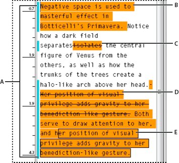
A.
Change bars B.
Added
text C.
Deleted text D.
Moved
text (from) E.
Moved text (to)
Turn on change tracking
 .
. appears
at the right end of the Story bar in Galley view and Story view.
appears
at the right end of the Story bar in Galley view and Story view.
How change tracking is displayed
Show or hide changes

Turn off change tracking
 .
.
View change information in the
Track Changes panel
Accept and reject changes

 .
.
 or Next Change button .
 or the Reject All Changes In Story button
  .
.
Set Track Changes preferences
Change the user name and color
Five Proofreading Tips for Businesses
Source: http://www.intelligentediting.com/resources/five-proofreading-tips-for-businesses/
1. Use House Style
2. Watch for Errors That Are Hiding in Plain Sight
3. Understand the Difference Between Proofreading and Copy-editing
4. A Good Sign-off Process Reduces Cost
5. Make Sure the Proofreader Is Not the Same Person as the Writer
Sunday, June 11, 2017
What is the Difference Between Copyediting and Line Editing?
Sunday, June 04, 2017
Proofreading
Source: https://www.learning.ox.ac.uk/media/global/wwwadminoxacuk/localsites/oxfordlearninginstitute/documents/pdg/managingyourself/1_guide-to-editing-and-proofreading.pdf
Oxford Learning Institute
University of Oxford
Guide to Editing and Proofreading
The Writer's Handbook
How to Proofread
Source: http://writing.wisc.edu/Handbook/Proofreading.htmlProofreading means examining your text carefully to find and correct typographical errors and mistakes in grammar, style, and spelling. Here are some tips.
Before You Proofread
- Be sure you've revised the larger aspects of your text. Don't make corrections at the sentence and word level if you still need to work on the focus, organization, and development of the whole paper, of sections, or of paragraphs.
- Set your text aside for a while (15 minutes, a day, a week) between writing and proofing. Some distance from the text will help you see mistakes more easily.
- Eliminate unnecessary words before looking for mistakes. See the writing center handout how to write clear, concise, direct sentences.
- Know what to look for. From the comments of your professors or a writing center instructor on past papers, make a list of mistakes you need to watch for.
When You Proofread
- Work from a printout, not the computer screen. (But see below for computer functions that can help you find some kinds of mistakes.)
- Read out loud. This is especially helpful for spotting run-on sentences, but you'll also hear other problems that you may not see when reading silently.
- Use a blank sheet of paper to cover up the lines below the one you're reading. This technique keeps you from skipping ahead of possible mistakes.
- Use the search function of the computer to find mistakes you're likely to make. Search for "it," for instance, if you confuse "its" and "it's;" for "-ing" if dangling modifiers are a problem; for opening parentheses or quote marks if you tend to leave out the closing ones.
- If you tend to make many mistakes, check separately for each kind of error, moving from the most to the least important, and following whatever technique works best for you to identify that kind of mistake.
For instance, read through once (backwards, sentence by sentence) to check for fragments; read through again (forward) to be sure subjects and verbs agree, and again (perhaps using a computer search for "this," "it," and "they") to trace pronouns to antecedents. - End with a spelling check, using a computer spelling checker or reading backwards word by word.
But remember that a spelling checker won't catch mistakes with homonyms (e.g., "they're," "their," "there") or certain typos (like "he" for "the").
When You Want to Learn More
- Take a class.
The Writing Center offers many workshops, including a number of grammar workshops. - Use a handbook.
A number of handbooks are available to consult in the Writing Center, and each Writing Center computer has an online handbook. - Consult a Writing Center instructor.
Writing Center instructors won't proofread your papers, but they'll be glad to explain mistakes, help you find ways to identify and fix them, and share Writing Center handouts that focus on particular problems.
Check for information on how to make an appointment with a Writing Center instructor.
For further information see our handout on Peer Reviews
Proofreading
Source: http://www.chicagomanualofstyle.org/tools_proof.htmlThe following list is taken from figure 2.6 of the 16th edition of the Manual.

Wannabe Editors: Can You Pass a Proofreading Test? By Carol Fisher Saller
Source: http://www.subversivecopyeditor.com/blog/2013/03/wannabe-editors-can-you-pass-a-proofreading-test.htmlMarch 4, 2013

When my office hires at the entry level, there’s a proofreading and copyediting test. My preference has been to give the test in person, on paper. That levels the playing field by eliminating access to e-mail and online sources. It shows how a person will mark up copy on the job (a frequent chore for the new kid). It isolates proofing and editing skills from word-processing skills.
Results vary.
So in the interests of helping young editors in search of employment, I’d like to talk about the second-most common* fatal error that candidates make on the test: that is, their failure to understand the concept of proofreading. Every time we hire, I rewrite the test instructions in the hopes of making them flunk-proof, but there is inevitably at least one smart, promising candidate who in spite of alleged experience proofreading and copyediting still manages to miss the point of the exercise.
In the proofreading test, the candidate is given two versions of a document: The first is a typed page, double-spaced and covered with corrections handwritten by a copyeditor. This is typically called the manuscript. The second is a typeset page—it looks like a photocopy of a page of a published book. The second was typeset from the first, and if all has gone well, the hand-marked corrections will have been incorporated into the typeset (final) version.
The test instructions say to proofread the typeset version, not to mark on the manuscript, and to query anything that isn’t clear. Experienced proofreaders know to read the typeset version against the manuscript very closely, comparing the two, looking at every letter and space and punctuation mark to make sure that the two versions are identical and that no text has been added or deleted by accident. In the olden days, two people would share the task: one would read the original aloud, including punctuation and corrections, while the other followed along in the typeset version.
Naturally, the typeset version has errors in it—after all, it’s a test. The errors are of three main types: (1) the typesetters failed to make a requested correction, (2) the typesetters introduced a new error in a place where no correction was marked, and (3) the typesetters followed the editor’s marking accurately, but the editor’s marking was incorrect. The third type should be rare.
The idea is to correct the first two kinds of errors without querying, and query the third kind.** Here is a table demonstrating the idea behind proofreading. The first column shows what is on the original manuscript; the second column shows how the manuscript was typeset; the third column shows what the proofreader should do.

Simple enough? Evidently not quite, for job candidates go wrong in two ways. First, they fail to compare closely enough, so in passages where all seems well in the typeset version, they miss the second type of error.
Worse, they query all three types of errors, instead of only the third. This is profoundly unhelpful in real life. It virtually defeats the purpose of proofreading, which is to flag unresolved issues—and only unresolved issues. Flagging nearly everything the editor marked for correction is tantamount to asking “Did you really mean to correct this?” when it is obvious that she did. It makes extra work, since she will have to check in each case. She might as well have proofread the thing herself.
Perhaps the concept of proofreading is trickier for a generation brought up in the digital age of typesetting, but fortunately, once it is understood, proofreading is the easiest of all editing tasks. And fortunately for proofreaders seeking work, there are still plenty of ways typesetting can go wrong.
______
*The most common error is sloppy handwriting. I feel hypocritical mentioning this, because I know I would never hire myself for a job that required neat writing. But even so, when I write something that I know must be read by colleagues, I take care over it. I make a habit of writing in pencil, and I often erase and rewrite. Bottom line: if a potential employer can’t read your test, and part of the job involves marking up copy for typesetters, you’re toast. So if you are going to be tested, and if you know your usual markings look like the paper in your gerbil’s cage after a week, take a couple of sharpened pencils and an eraser with you. If you forget, ask for them. (Yes, you’ll look like a loser in the moment, but it’s better than making a mess in ink. And depending on the competition, you might still have a chance.)
**In real life, proofreaders are not always charged with querying anomalies, and excessive querying that amounts to second-guessing the copyeditor is not the goal.
What’s the Difference Between Copyediting and Proofreading?
Source: https://nybookeditors.com/2016/05/whats-the-difference-between-copyediting-and-proofreading/May 2016

One of the most confusing parts of the editing process is simply understanding the different types of edits. There are line edits and copyedits, proofreading and manuscript critiques, and that’s just the beginning. For the new author, the whole editing process can feel overwhelming, especially if you’re not sure which one to choose for your manuscript.
Fortunately, you’ve come to the right place.
In this post, we’re going to break down the differences between copyediting and proofreading in order to help you understand the editing process better. You can also use this post to decide which one you’ll need for your manuscript. Let’s get started.
What is Copyediting?

Copyediting is the process of checking for mistakes, inconsistencies, and repetition. During this process, your manuscript is polished for publication.
Contrary to popular belief, the copyeditor is not a glorified spell checker.
The copyeditor is your partner in publication. He or she makes sure that your manuscript tells the best story possible. The copyeditor focuses on both the small details and the big picture. He or she must be meticulous and highly technical, while still aware of the overarching themes at work within your manuscript.
Let’s take a closer look at what a copyeditor does. A copyeditor:
- Checks for and corrects errors in grammar, spelling, syntax, and punctuation.
- Checks for technical consistency in spelling, capitalization, font usage, numerals, hyphenation. For example, is it e-mail on page 26 and email on page 143? Or do you use both British and American English spelling variations interchangeably, such as favourite vs. favorite?
- Checks for continuity errors and makes sure that all loose ends are tied.
- Checks for factually incorrect statements. This is a necessary part of the copyediting process for non-fiction manuscripts, such as historical pieces and memoirs. The copyeditor must check if the facts in your manuscript are accurate and if the names and dates are correct.
- Checks for potential legal liability. The copyeditor verifies that your manuscript does not libel others.
- Checks for inconsistency within the story. This includes character description, plot points, and setting. Does each character stay true to his own description throughout the story? Are there conflicting descriptions of the house? For example, have you described the setting as “a yellow brick home” on one page but “a weathered wooden home” on another page?
As you see, the copyeditor’s job is not just to check grammar and spelling. He or she must make sure that every element of your story is consistent, cohesive, and complete.
Your copyeditor will be different than your general editor. The copyeditor comes with a unique skillset. He or she must be precise, detail-oriented, and adroit in grammar and word usage. The copyeditor is also up to date with the standard practices in book publishing.
Am I Ready for Copyediting?
Copyediting is the final step before production. It should be done after all other edits take place. In a standard timeline, here’s how the copyedit fits in:
Manuscript Critique – An editor reads your manuscript and prepares a broad, comprehensive assessment. You receive specific advice on how to develop a stronger narrative, better pacing, and more engaging characters.
Because the manuscript critique is a big picture analysis of your manuscript, it should be done first before getting into the nuts and bolts of a comprehensive edit.
Comprehensive Edit – In-depth, intense, thorough, a comprehensive edit tackles a manuscript line by line. The editor cuts down on wordiness and tightens the language to create a more enjoyable read. This type of edit hunts down clumsy or awkward sentences that take away from the rhythm of your prose. For more information on a comprehensive edit, especially a line edit, click here.
If you plan to go with a traditional publisher, these are the only two types of edits you’ll need. After your comprehensive edit, you can start querying agents (we can help with that, too). Once your manuscript is accepted, the publisher will perform copyedit prior to production.
However, if you plan to self-publish, we highly recommend that you hire a professional copyeditor to prepare your manuscript for publication.
Why?
As a writer, you’re probably very familiar with the concept of typo blindness. Nick Stockton over at Wired explained it best in his post: What’s Up With That: Why It’s So Hard to Catch Your Own Typos. Brilliant read.
The basic idea is that you’re unable to see your own mistakes because you already know what you’re trying to convey. You need a second pair of eyes—preferably from someone who knows the rules of grammar—to look over your manuscript and correct glaring errors that you’ve gone blind to.
In traditional publishing, copyediting is a required step. Who wants to print off a thousand books only to find that there’s a typo on page two, or a discrepancy in character description from one chapter to the next? Not you, and definitely not your reader.
Unfortunately, many self-published writers skip this crucial step and end up with those exact results. When the flow of the story is interrupted by inconsistencies in the narrative or errors in grammar, not only is it embarrassing for the writer, it can also be confusing to the reader.
As a necessary last step before printing your manuscript, always hire a professional copyeditor to inspect your work with a fine tooth comb. You’ll feel much better knowing that your typo blindness hasn’t negatively impacted your final work.
Remember, copyediting is only available to authors who’ve completed a comprehensive edit. This ensures that the copyeditor isn’t spending time editing content that may be deleted or rearranged after a line edit. The copyedit should always be the last step.
How Long Does a Copyedit Take?
A copyedit of your manuscript takes anywhere from three to five weeks.
What is Proofreading?

In publishing, proofreading happens after the manuscript has been printed. A final copy of the manuscript, or proof, is then examined by a professional proofreader.
The proofreader’s job is to check for quality before the book goes into mass production. He or she takes the original edited copy and compares it to the proof, making sure that there are no omissions or missing pages. The proofreader corrects awkward word or page breaks.
While he or she may do light editing (such as correcting inconsistent spelling or hyphenations), the professional proofreader is not a copyeditor. If too many errors are cited, he or she may return the proof for further copyediting.
Professional proofreading is required by traditional publishers as a quality assurance measure before printing off a mass quantity of books. Many self-publishing authors who have had their manuscript professionally copyedited skip the proofread. If you’re on a budget, you might try to proofread your own work, since there won’t be as many errors to contend with at that stage.
Monday, May 22, 2017
Poster Designs By Seth Wilson - Typography Theory, Color, Design
Source: http://inkfumes.blogspot.com/2011/10/poster-designs-color-design-typography.html
October 11, 2011
I created these poster designs over the summer. They are free to download and print for educational purposes. The posters have been created in a large format but can be printed at any size. I created these for my own classrooms where I teach video production, graphic design, web design and digital photography. Scroll down to the bottom of the page for the download link... if you repost please attribute credit.
Typography Poster:

Color Theory Poster A:

Color Theory Poster B:

Elements of Design Poster:

Principals of Design Poster:

More from Seth Wilson can be found here.
Monday, May 15, 2017
Typography rules and terms every designer must know By Creative Bloq Staff
Source: http://www.creativebloq.com/typography/what-is-typography-123652
March 08, 2016
We explain the fundamental concepts and terminology of typography in words you can understand.
Typography is, quite simply, the art and technique of arranging type. It's central to the skills of a designer and is about much more than making the words legible. Your choice of typeface and how you make it work with your layout, grid, colour scheme, design theme and so on will make the difference between a good, bad and great design.
There are lots of typography tutorials around to help you master the discipline. But good typography is often down to creative intuition. Once you're comfortable with the basics, visit some typography resources to investigate font families and discover some font pairings that are made for each other.
Choosing a font
There's an astonishing array of paid-for and free fonts to choose from online. But with great power comes great responsibility. Just because you can choose from a vast library doesn't mean you have to; there's something to be said for painting with a limited palette, and tried and tested fonts like Helvetica continue to serve us well.

A typeface, like any form of design, is created by craftsmen over a substantial period of time, using the talent they've been honing for many years. And the benefits of a professionally designed font – various weights and styles to form a complete family, carefully considered kerning pairs, multi-language support with international characters, expressive alternate glyphs to add character and variety to type-setting – are not always found in a font available for free.
Here are some of the most important typographic considerations the professional designers needs to take into account.
01. Size
All typefaces are not created equally. Some are fat and wide; some are thin and narrow. So words set in different typefaces can take up a very different amount of space on the page.
The height of each character is known as its 'x-height' (quite simply because it's based on the letter 'x'). When pairing typefaces – such as when using a different face to denote an area of attention – it's generally wise to use those that share a similar x-height. The width of each character is known as the 'set width', which spans the body of the letter plus a space that acts as a buffer with other letter.
The most common method used to measure type is the point system, which dates back to the 18th century. One point is 1/72 inch. 12 points make one pica, a unit used to measure column widths. Type sizes can also be measured in inches, millimetres, or pixels.
02. Leading
Leading describes the vertical space between each line of type. It's called this because strips of lead were originally used to separate lines of type in the days of metal typesetting.
For legible body text that's comfortable to read, a general rule is that your leading value should be greater than the font size; anywhere from 1.25 to 1.5 times.
03. Tracking and kerning
Kerning describes the act of adjusting the space between characters to create a harmonious pairing. For example, where an uppercase 'A' meets an uppercase 'V', their diagonal strokes are usually kerned so that the top left of the 'V' sits above the bottom right of the 'A'.
Kerning similar to, but not the same as, 'tracking'; this relates to the spacing of all characters and is applied evenly.
04. Measure
The term 'measure' describes the width of a text block. If you're seeking to achieve the optimum reading experience, it's clearly an important consideration.
05. Hierarchy and scale
If all type was the same size, it would be difficult to know which was the most important information on the page. In order to guide the reader, then, headings are usually large, sub-headings are smaller, and body type is smaller still.
Size is not the only way to define hierarchy – it can also be achieved with colour, spacing and weight.
Next page: Glossary of typography A-D
The glossary (A-D)

Key to image: 1. Bowl; 2. Stem; 3. Counter; 4. Arm; 5. Ligature; 6. Terminal; 7. Spine; 8. Ascender; 9. Apex; 10. Serif; 11. Ear; 12. Descender; 13. Crossbar; 14. Finial; 15. Ascender height; 16. Cap height; 17. X-height; 18. Baseline; 19. Descender line
Aesc

Pronouced 'ash', this is a ligature of two letters – 'a' and 'e'. The aesc derives from Old English, where it represented a diphthong vowel, and has successfully migrated to other alphabets including Danish and Icelandic.
Aperture

The constricted opening of a glyph, as seen in the letter 'e'. Varying the size of the aperture has a direct effect on the legibility of a letterform and, ultimately, readability.
Apex
The point at the top of a character where the left and right strokes meet. The example shown in the header image is the top point of an uppercase 'A'.
Arm
A horizontal stroke that does not connect to a stroke or stem at one or both ends – such as the top of the capital T.
Ascender

The part of a lowercase letterform that projects above the x-height of the font. Ascenders are important for ease of prolonged reading, though the combination of too much ascender-height and not enough x-height can cause problems.
Baseline
The baseline is where the feet of your capital letters sit. Below this line are descenders and loops.
Bowl
The shapely, enclosed parts of letters such as 'p' and 'b'.
Beak
The beak-shaped terminal at the top of letters such as 'a', 'c', 'f' and 'r'.
Bicameral (as opposed to unicameral)
Bicameral refers to alphabets that have upper- and lowercase letterforms, such as Roman and Cyrillic – as opposed to the likes of Hebrew and Arabic.
Bracket
A wedge-like shape that joins a serif to the stem of a font in some typefaces.
Cap height
The height of a capital letter above the baseline.
Copyfitting
The job of adjusting point size and letter spacing in a bid to make text occupy its allotted space in a harmonious fashion.
Counter

The enclosed – or partially enclosed – portion of letterforms such as 'c', the lower part of 'e' and 'g'; easy to get mixed up with the bowl.
Crossbar
The crossbar connects two strokes, as in 'H'. Not to be confused with the crossstroke that cuts through the stem of letterforms such as 't'.
Cursive
These are typefaces that imitate handwriting. Ever popular with Joe Public, the design community is often less than thrilled by these sometimes flowery fonts.
Descender
The part of the letterform that falls below the baseline. In lowercase terms, this means 'p', 'y' and 'q', and sometimes applies to uppercase 'J' and 'Q'.
Diacritical

Is it so critical that you might die? No. Diacriticals refer to accents applied to letterforms by languages including French, Czech and German in a bid to enhance the function of the glyph.
Dingbat

Once known as printer's flowers, dingbats are decorative elements that can vary from simple bullets to delicate fauna and flora, often formed into themed collections.
Display fonts
Any typeface intended to be used in short bursts can be defined as a display font. They're often created just for use at large point sizes, as with headlines and titles.
Drop cap

An oversized capital letter often used at the start of a paragraph that 'drops' into two or more lines of text, but can also climb upwards.
Next page: Glossary of typography E-L
Ear
A small stroke extending from the upper-right side of the bowl of lowercase g, as shown in the example. It can also appear in a lowercase r.
Ethel
A ligature of the letters 'o' and 'e'.
Em dash

Often referred to as 'Mutton' to distinguish it from the very similar-sounding En, Em is a horizontal space equal to the current point size of text.
En dash
'Nut' to its friends, the En is a horizontal measure one half the size of an Em. That being the case, 'lamb' might have been more appropriate.
Eye
The eye is similar to a counter, but instead refers specifically to the enclosed part of the letter 'e'.
Finial
A tapered or curved end, which appears on letters such as e and c.
Fleuron
A subcategory of, or the precursor to, the dingbat. Fleurons are floral marks dreamed up by printers of the past to help decorate text.
<font-face>
The HTML5 tag that brings typography to the internet with typefaces directly embedded in web pages.
Glyph

Any singular mark that makes part of a font, whether a letter, number, punctuation mark or even a dingbat. Glyphs are the building blocks of typography.
Grapheme
Very similar to glyph, but possibly a bit broader. A grapheme is a fundamental unit of language, such as a Chinese pictogram, an exclamation mark or a letterform. Still with us in our guide to what is typography? Great! Because we've got more terms coming your way!
Gutter
The spaces between facing pages of, and very often columns of text.
Justified
In a paragraph of justified text, when the contents are arranged so that there is no white space at the end of a line: each begins flush left and finishes flush right.
Kerning

The art of adjusting the proximity of adjacent letters to optimise their visual appeal and readability.
Leading

Leading describes the vertical space between each line of type. In olden times actual strips of lead were used to separate lines of text vertically; the naming convention persists.
Legibility
The ease with which one letterform can be distinguished from the next. It feeds into but is not the same as readability.
Loop

The lower part of the letter 'g' is known as its loop or lobe. Sometimes called the tail – a term that also takes in the lower portion of letter 'y'.
Logotype
The lettered part of any marque or identity. The logotype can be taken separately from its graphic companion.
Ligature
The conjoined but non-identical twins of the typographic universe. Ligatures pull two forms together to produce a new glyph.
Next page: Glossary of typography M-Z
Manicule
Also known as the bishop's fist (stop sniggering at the back), the pointing hand symbol is a popular dingbat.
Monospace

Fonts in which every letterform occupies the same horizontal space.
OpenType
Designed by Microsoft and Adobe, OpenType supplanted and improved upon TrueType and PostScript fonts.
Oblique or sloped roman
To be distinguished from italics, in which the letterforms are purposefully drawn to be different to their upright cousins. Oblique letters are merely slanted versions of the standard roman form, often arrived at by mechanical means.
Orphan
The first line of a new paragraph stranded at the bottom of a page. This is considered to be as bad as the name suggests.
Pica
One sixth of an inch in length, the pica is associated with line-length and column width. There are 12 points or 16 pixels in one pica.
Pilcrow
The paragraph symbol, it now marks the presence of a carriage return but at one time is thought to have denoted a change of theme in flowing text.
Point
A standard typographical measurement equal to 1/12 of a pica or 1/72 of an inch.
Readability
Readability refers to the ease with which a block of text can be scanned by eye.
Serif
A flare or terminating flourish at the end of a letterform's strokes believed to originate with the Roman tendency to paint letters onto marble before chiselling them out.
Sidebearing
The horizontal space to either side of a letterform, separating it from other letters.
Spine
The main curved stroke of a lowercase or capital S.
Squoosh

This is the inadvisable process of squashing or expanding a typeface digitally either to fit a space or for visual effect. If you do it, make sure you keep it to yourself.
Spur
A small projection from the curve of a letterform, sometimes known as a beak or a beard. G provides a good example.
Stem
A vertical, full-length stroke in upright characters.
TDC
The Type Directors Club is a typography organisation based in New York.
Tittle

The brilliantly suggestive name for the dot above letters 'i' and 'j'.
Terminal
A type of curve at the end of a stroke. Examples include the teardrop shapes in: 'finial', 'ball', 'beak' and 'lachrymal'.
x-height
The height of the lowercase x in any given typeface. This delimits the size of the glyph's detail and therefore also of its ascenders and descenders.
This is a revised and updated version of an article published previously on Creative Bloq.
Like this? Read these:
- Add some personality with these handwriting fonts
- We reveal the best web fonts for your site
- Download fonts from these top resources
- Browse through our how to draw collection
- How to improve your character drawing